Hapbee
Case Study
Redesigning Hapbee around user goals
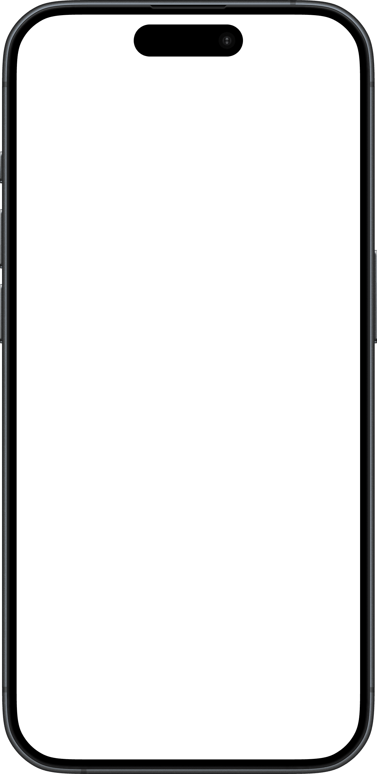


Home
Connected
100%


Scenarios
Quickly jump into something based on what you’re doing.

AM

PM
Recent



Adenosine

Sleep Recovery

CBD

Post Workou...
Playlists by Ambassadors




AM
PM

Get ready for bed
Adenosine
-14:32




Connected
96%


- Role
- Lead product designer
- Timeline
- 2024 · 12 months
- Part-time contract
- Team
- 2 designers
- 2 engineers
- CTO
Scope
- Product strategy & design
- UX research
- Visual system
- Interaction design
- Component library
- 3D assets
Overview
Hapbee is a wearable wellness company that uses ultra-low radio frequency energy to safely reproduce the magnetic signatures of compounds like caffeine or melatonin, allowing users to feel their desired state on demand.
The Challenge
Around the time I joined, expectations for the product were rising quickly.
Hapbee was gaining exposure through the NBA and landing major enterprise partners. The app still relied heavily on one-to-one guidance, while the user experience and visual design fell short of what consumers and partners expected.
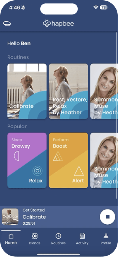
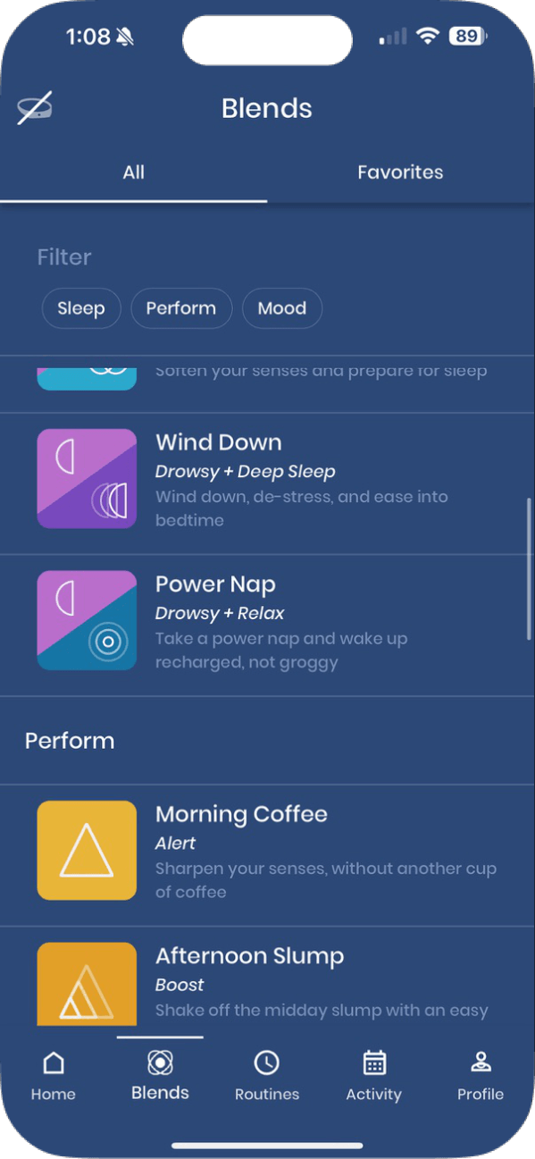
Existing Product
Objective
My role was to improve the mobile experience and establish a stronger visual foundation that could support its growth, and meet the expectations of consumers and enterprise partners.
Research & Discovery
The data showed where people were getting stuck. Research helped explain why.
I reviewed the product, analytics, support tickets, and competitive patterns, then used interviews and task-based walkthroughs to understand the behaviours behind those signals.
Research method
Objective
01
Product audit & heuristic evaluation
Evaluate the existing experience, identify usability issues, and assess the product's architecture
02
Stakeholder interviews
Understand business objectives, constraints, and existing challenges
03
Product analytics
Identify patterns in retention, engagement, and content usage
04
Support-ticket analysis
Identify recurring sources of confusion and friction
05
User interviews
Understand motivations, behaviors, and pain points
06
Task-based walkthroughs
Observe where users struggle in the existing product
07
Competitive analysis
Evaluate established UX patterns, content discovery approaches, and visual design conventions across comparable products.
Product Analytics
Early signals raised questions about adoption, comprehension, and confidence
18%
Of new users contacted support in their first 30 days. Most contacts related to device confidence or product comprehension.
24%
Returned during days 31–60 after their first completed session.
92%
Replayed their most recent Playable as their first action.
Behavioural Insights
4 key insights emerged from user interviews and walkthroughs
01
Product comprehension
Users struggled to distinguish content types and choose what to play.
02
First-use experience
The experience did not provide a clear path from setup to a first session.
03
Device confidence
Limited device and session feedback created uncertainty about whether the product was working.
04
Content discovery
10/10 participants started with a desired outcome rather than a specific item in the library.
Focus for the Redesign
01
Reduce friction on first use
Create a clearer path through setup and the first session.
02
Build understanding and confidence
Explain content, device states, and session feedback in context.
03
Make discovery more intuitive
Organize discover around what users want to achieve.
04
Elevate product quality
Establish a cohesive visual system that improves clarity and credibility.
05
Support progress over time
Help users set longer-term goals and connect individual sessions to their progress.
The goal was to make Hapbee easier to understand, easier to start using, and easier to trust. That meant helping people reach a useful session with less guidance, find content around what they wanted to achieve, and experience a product that felt clear and credible.
Restructuring the Experience
People came to Hapbee with a goal, yet the product was organized around content types.
Home, Blends, and Routines all competed as places to explore. I reorganized the experience around Perform, Mood, and Sleep, then created clearer paths for discovering something new or returning to familiar content.
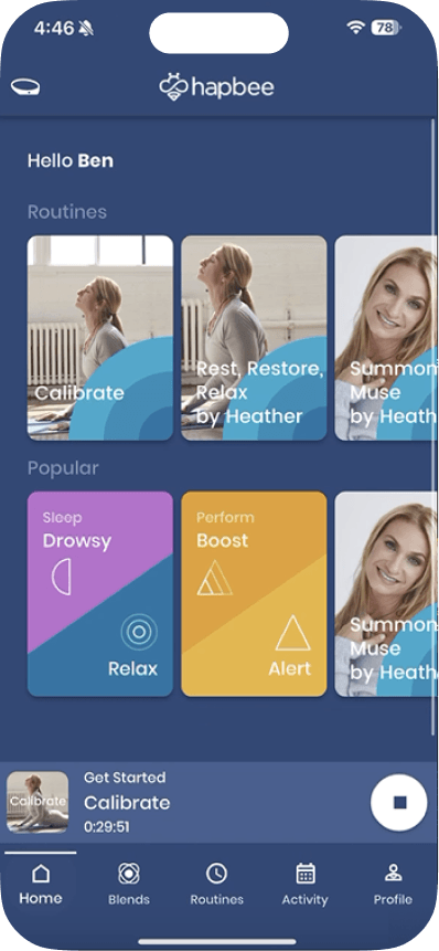
Before
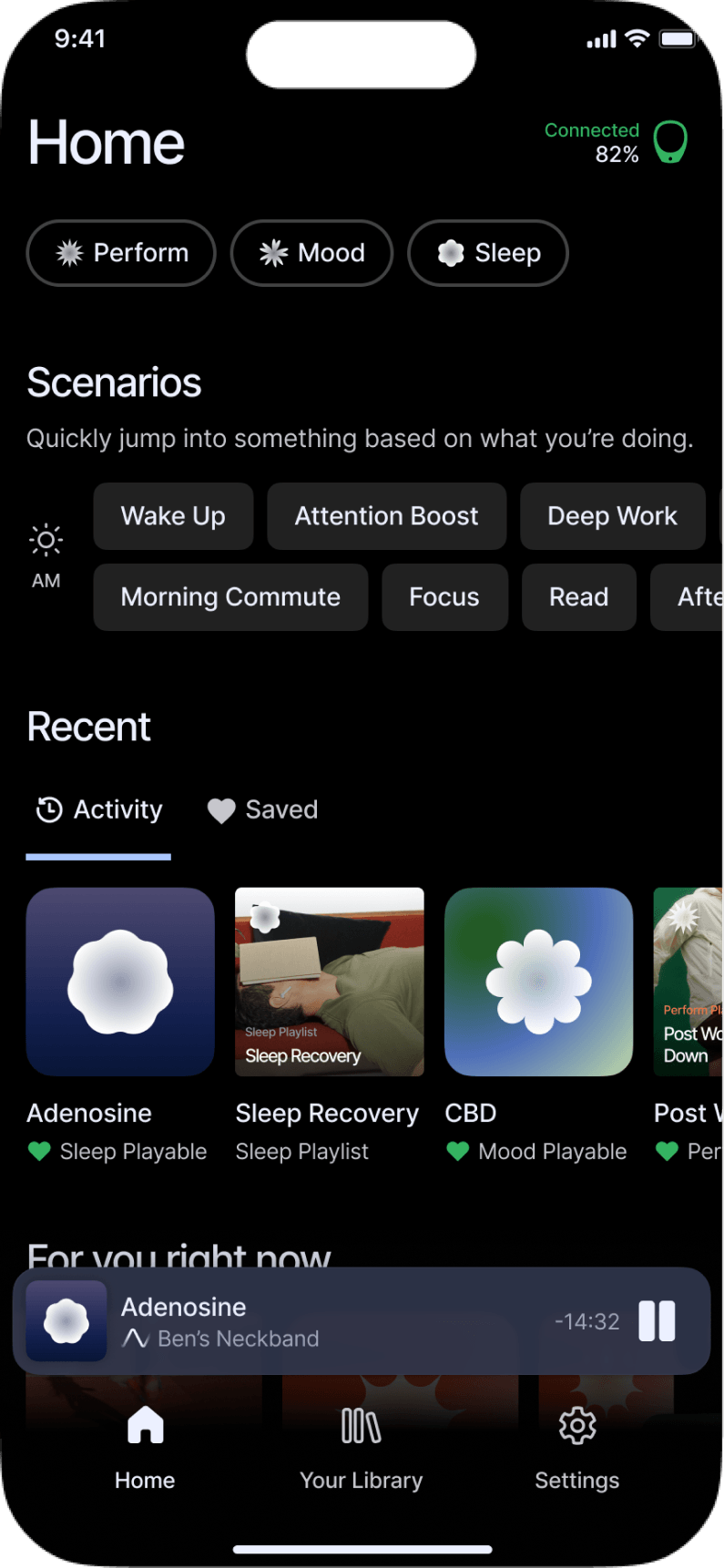
After
I looked at products like Headspace, Spotify, and Apple Fitness, who organize content libraries around categories and goals. I was looking for patterns rather than copying a specific interface: how categories appear in navigation, how a category page establishes context, and how users move from browsing into a specific item.
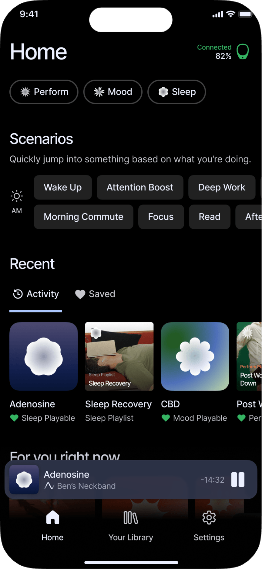
Home & Navigation
A home screen and navigation shaped around user behaviour
I simplified the bottom navigation around the app’s most stable destinations. A clearer Home page hierarchy brings the most useful paths forward, so people spend less time deciding where to go.
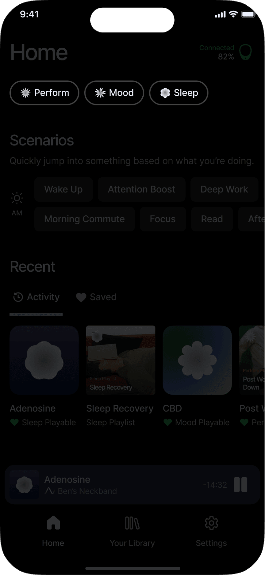
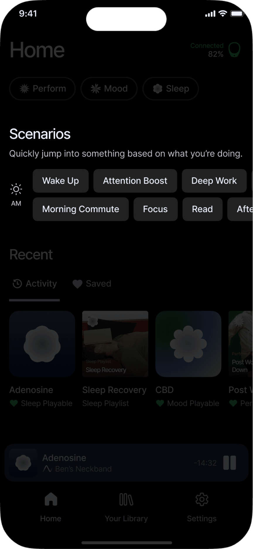
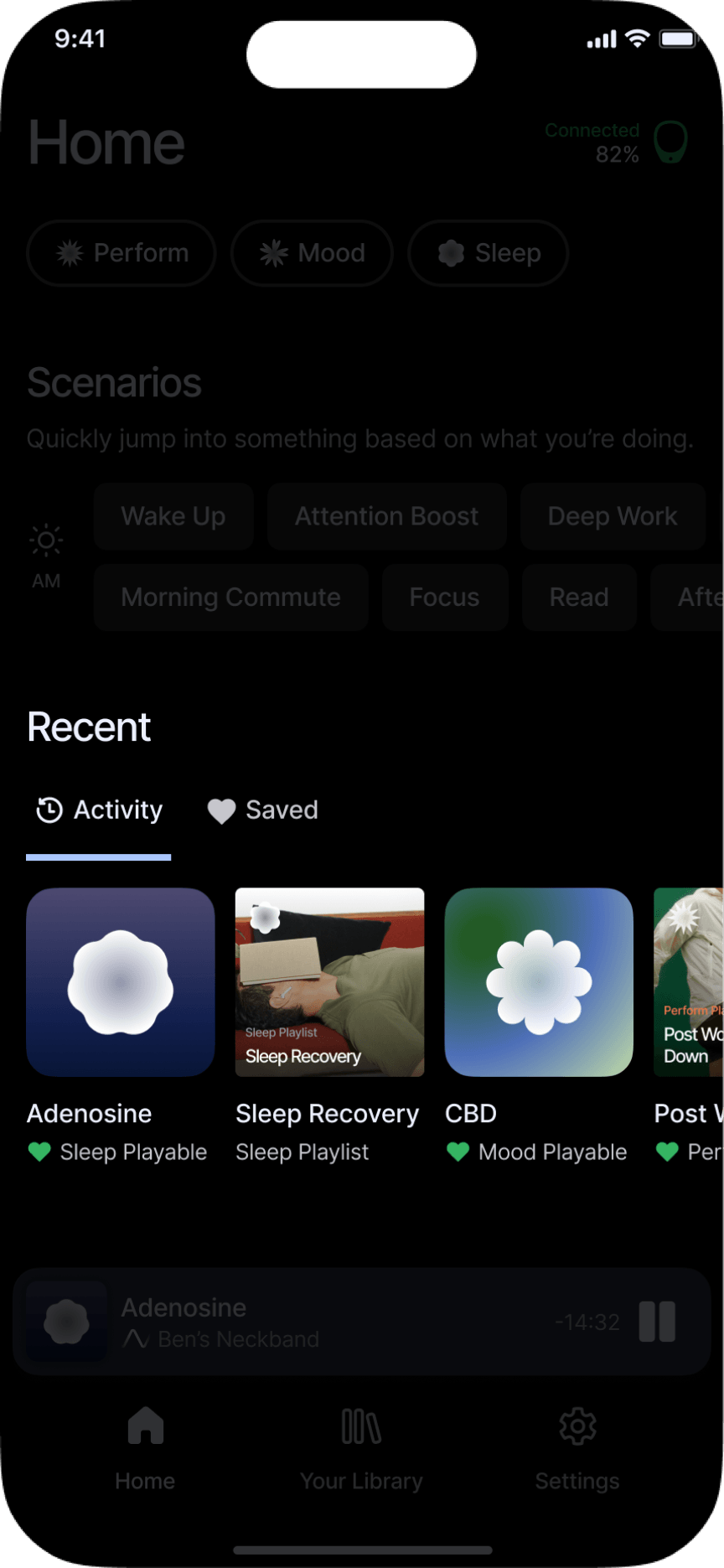
The core loop
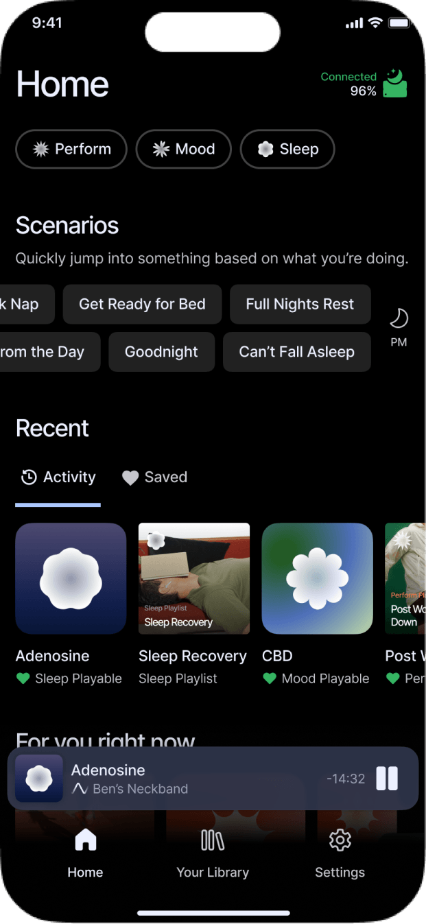
Home
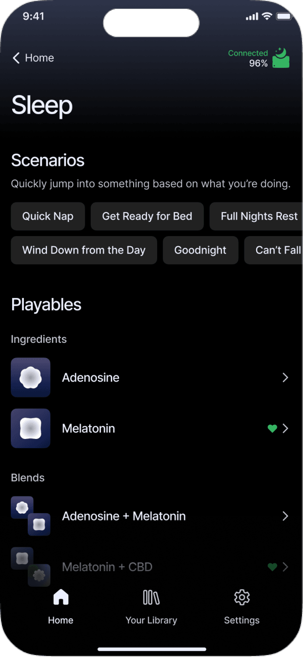
Category
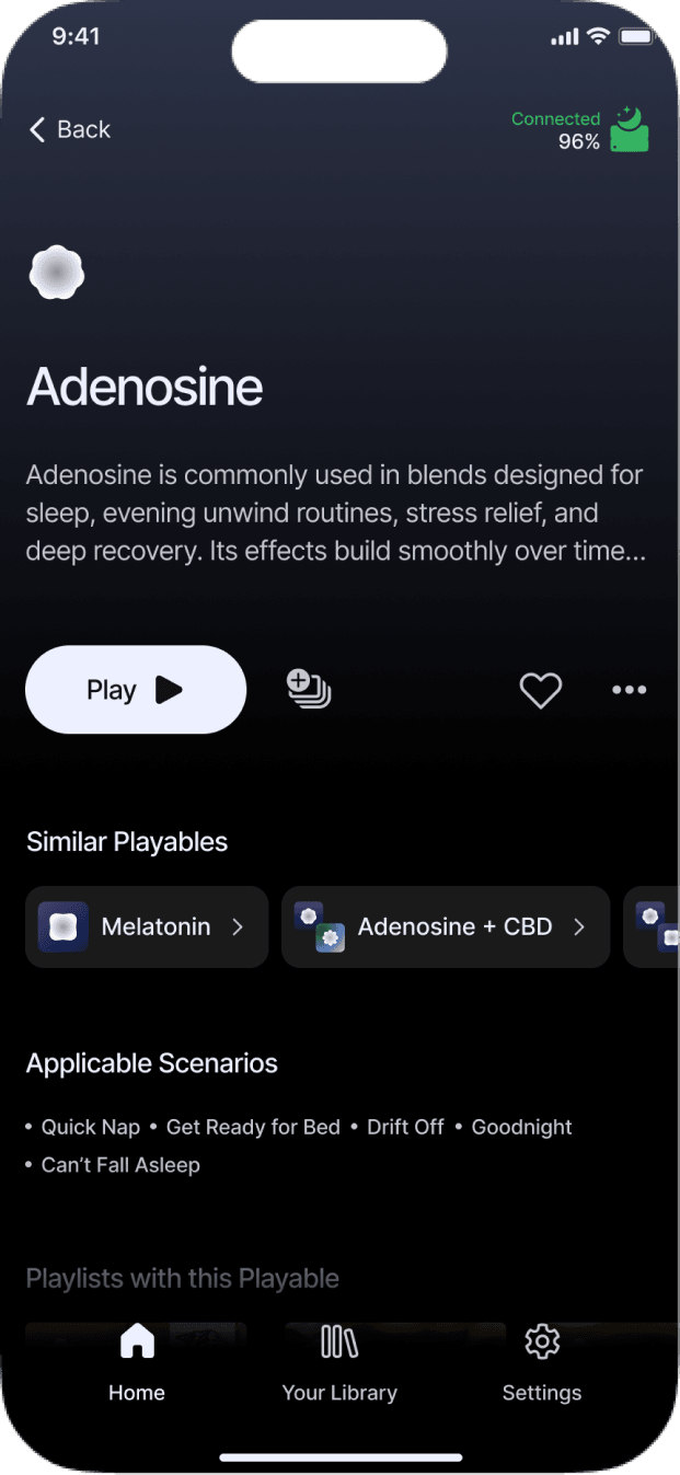
Playable
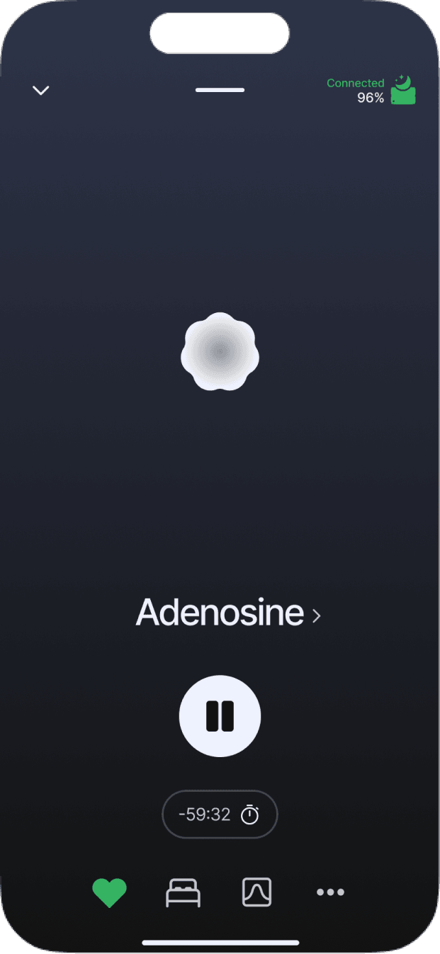
Player
Establishing a cohesive visual language
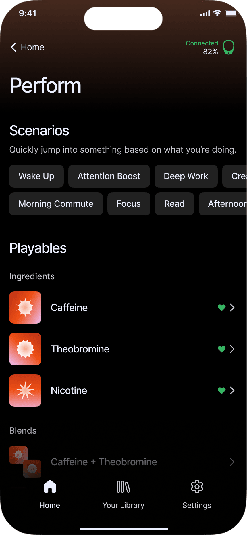
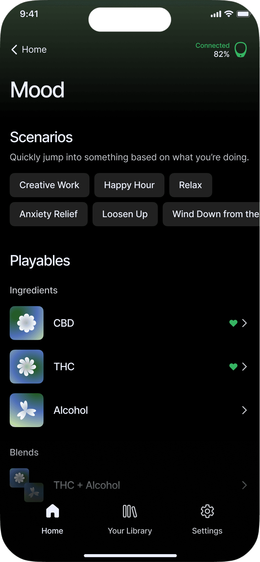
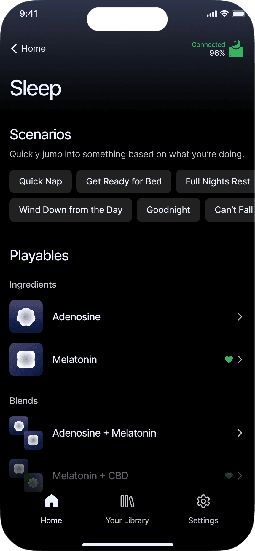
Alongside the need to feel more credible and professional, the redesign had to reinforce the category-led architecture and the shift toward ingredient-based naming.


Naming
Name the ingredient, not a single outcome.
Labels such as “Alert” made a Playable sound useful for one thing. An A/B test supported ingredient names as a clearer foundation for content with multiple use cases.
Tradeoff
Keep outcome language where it helps.
Ingredient names required people to learn more. Scenarios balanced that tradeoff by keeping familiar language such as “Attention Boost” available as a direct starting point.
Visual rules
Make each category feel distinct at a glance.
Each category received its own gradient and shape language. Ingredient artwork inherited those cues, making the system recognizable without asking people to decode individual shapes.
Guiding users through first use
New users had a lot to figure out before they could get value from Hapbee.
They had to learn unfamiliar terminology, set up a physical device, and understand what to do next. The goal was to make that journey feel more manageable and help people reach a useful first session without needing someone from Hapbee to guide them.
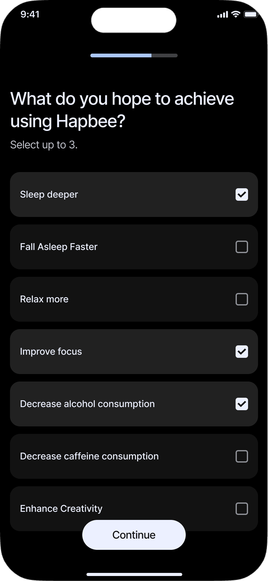
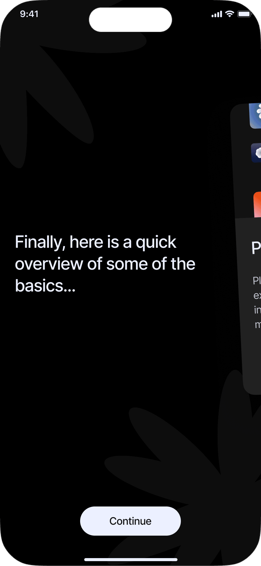
Onboarding - Goals & Education
We wanted to get people to a useful first session as quickly as possible. I streamlined the flow, captured what they wanted from Hapbee, and introduced only the product knowledge needed to get started. Everything else could be learned later, in context.
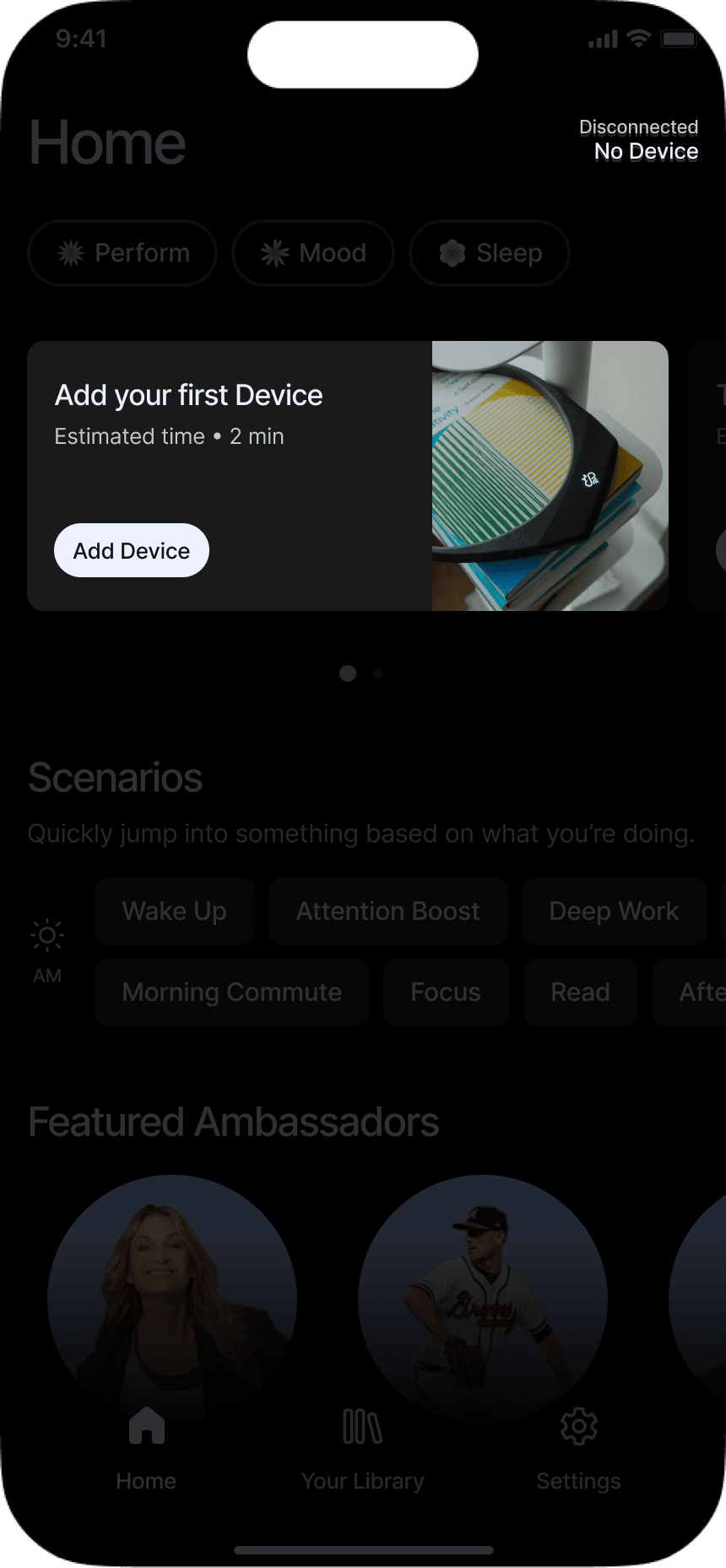
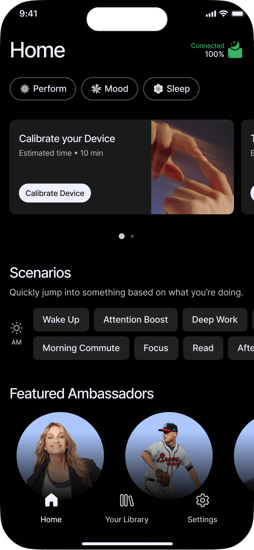
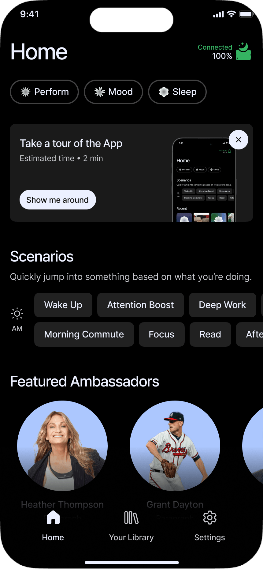
Getting started - next best actions
Once a new user reaches Home, the next step changes with their progress — adding a device, calibrating it, or optionally taking a tour. A straight forward, but necessary addition.
Building User confidence
Confidence was one of the biggest gaps. People weren’t always sure whether their device was connected, whether a session was playing, or what it meant when they didn’t feel an effect. I ran into the same uncertainty using Hapbee myself.
I focused on removing as much of that guesswork as possible — first by reworking device setup and status, then by adding a post-session check-in.
Device setup & Status
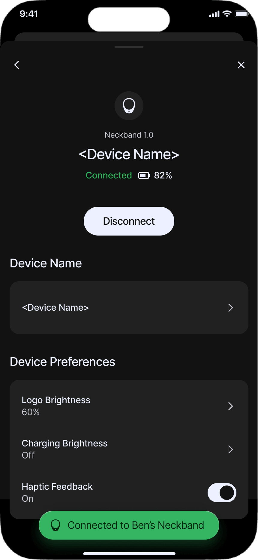
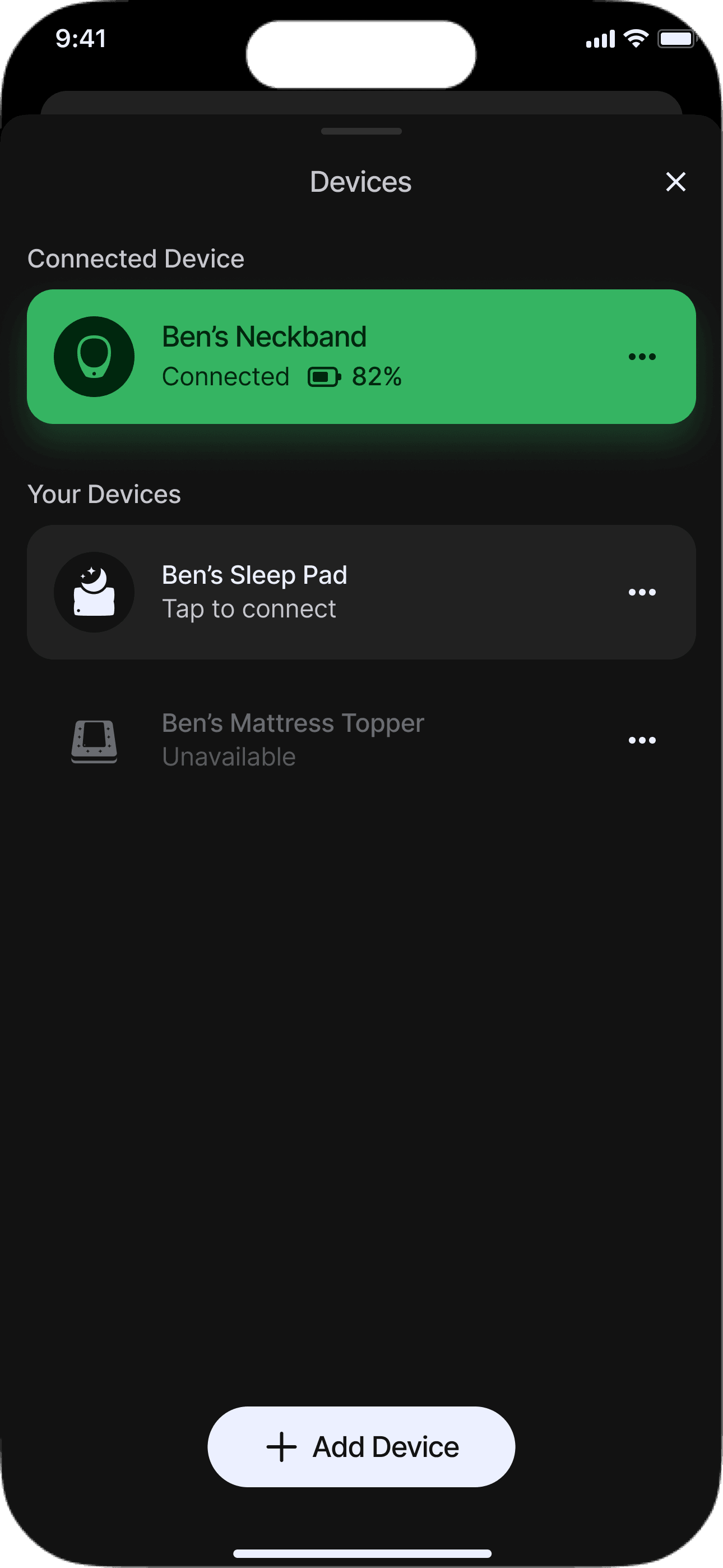

 Ben’s Neckband

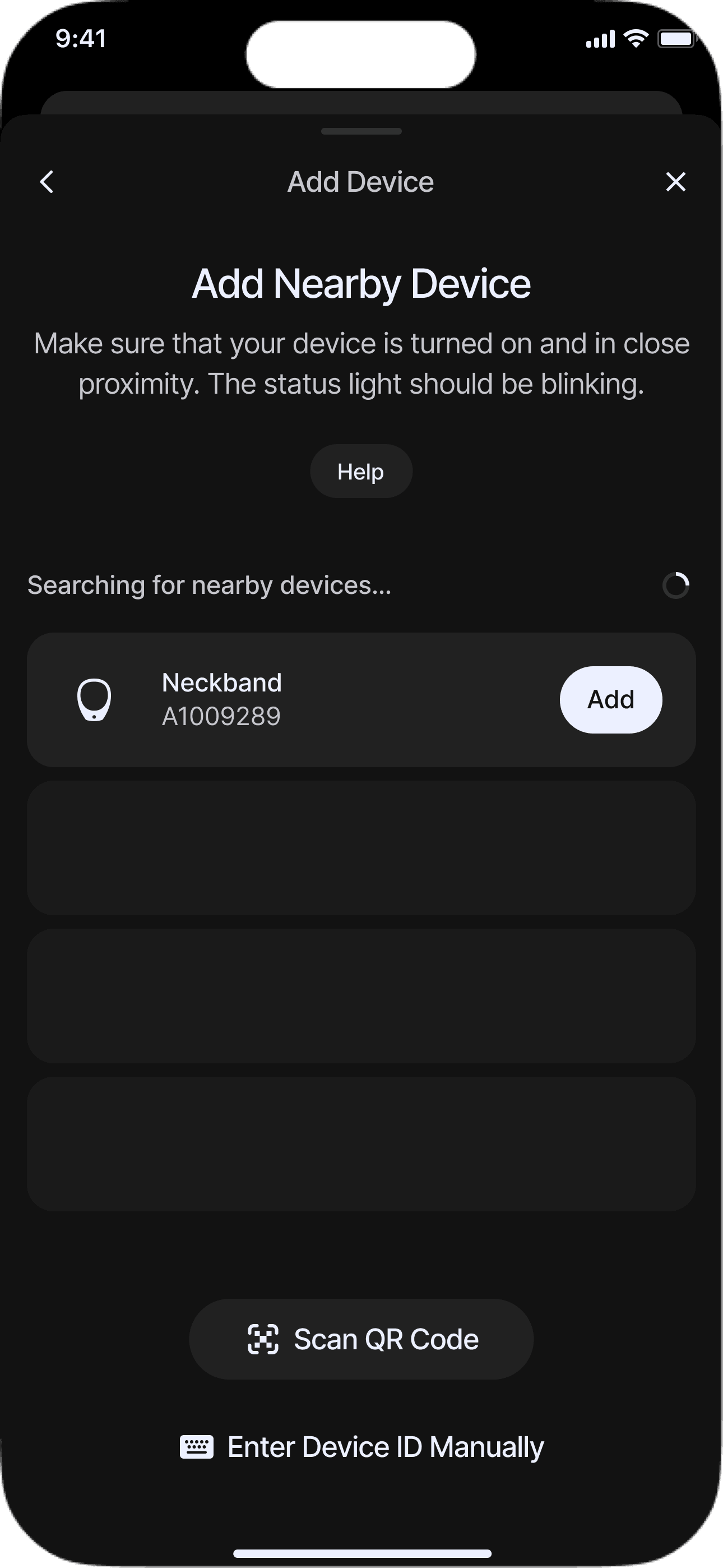
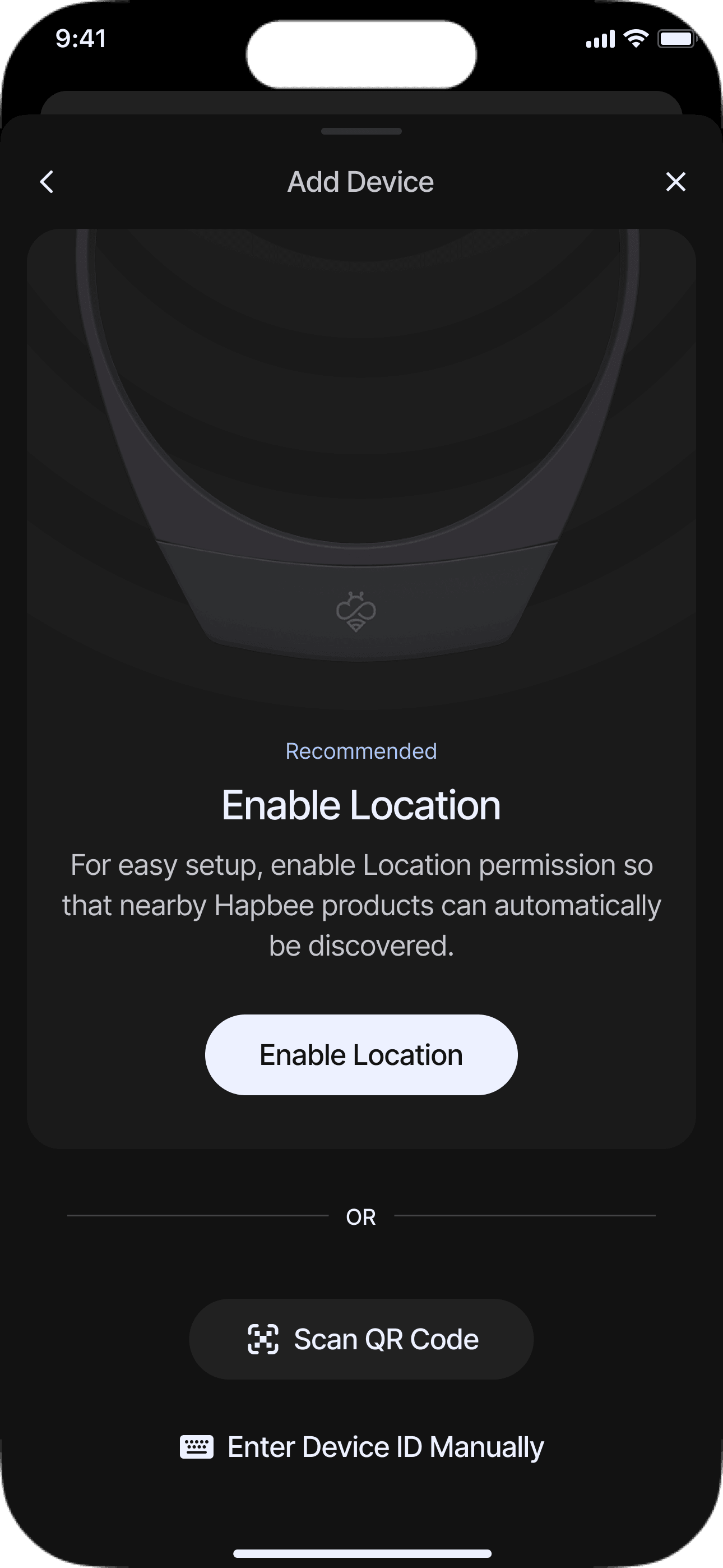
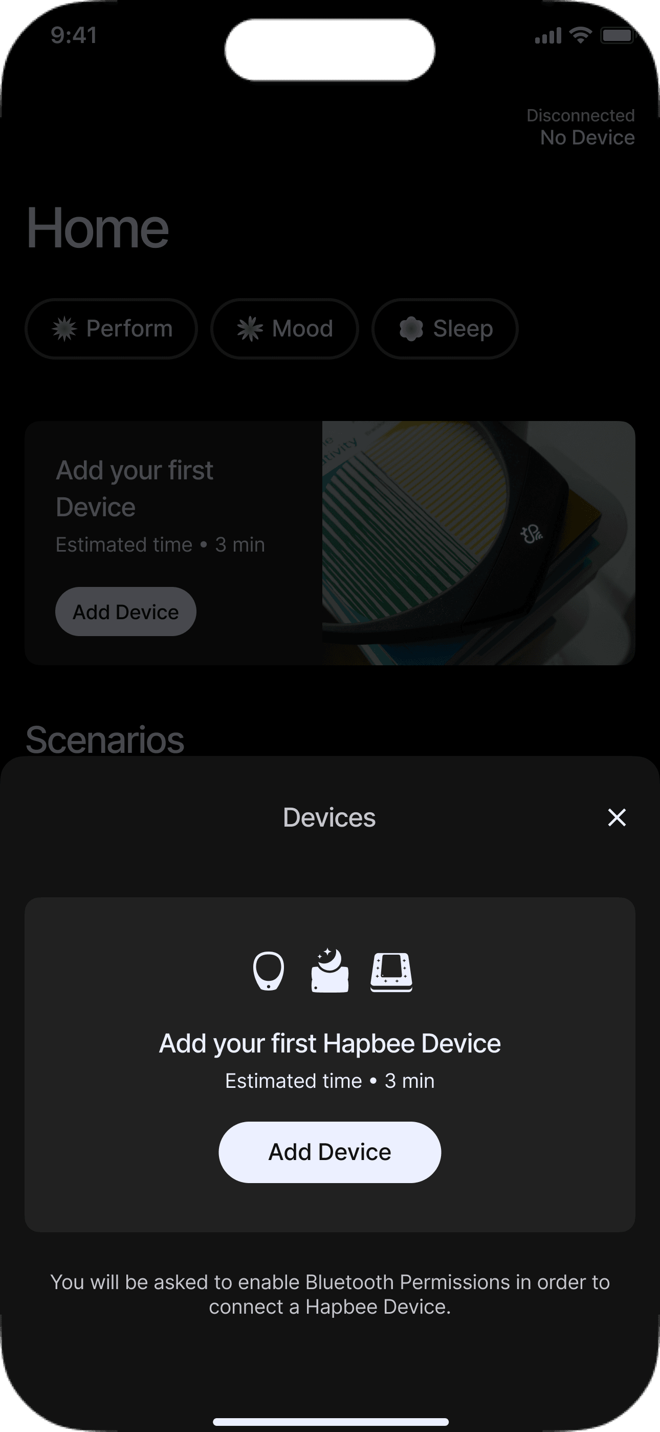
I simplified the device setup flow and made the recommended connection method more obvious, while keeping the other options available. Clearer status, loading, confirmation, and playback states gave people continuous feedback about what the device was doing.
Session Feedback
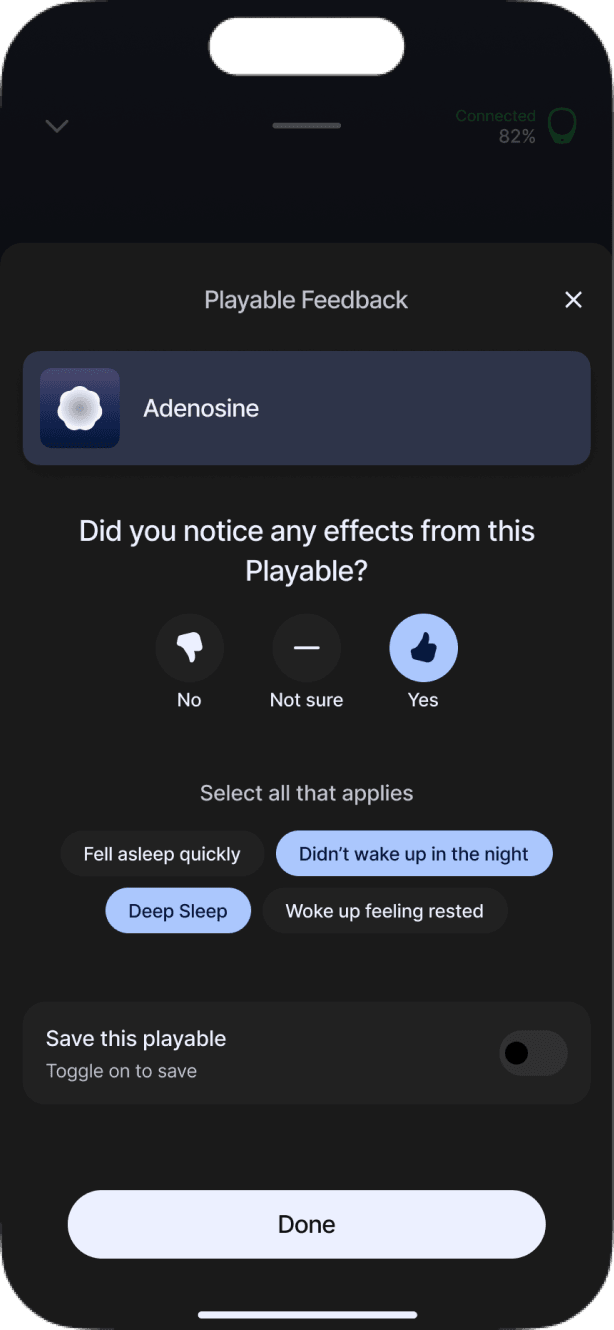
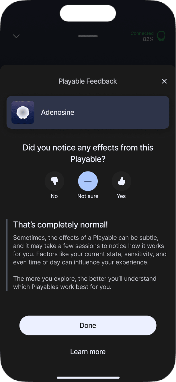
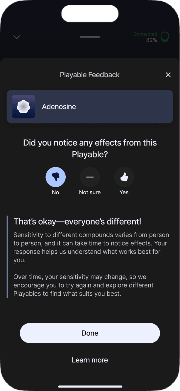
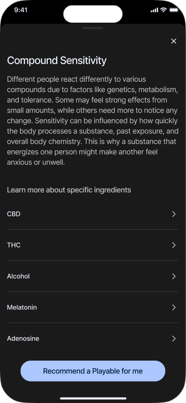
Because the experience could vary from session to session, I added a quick check-in after playback. It acknowledged what people felt, offered education when they felt little or nothing, and gave the product a signal to improve future recommendations. Over time, this allowed Scenarios to avoid Playables someone had previously rated poorly.
Outcomes
I compared monthly cohorts from before the redesign, after launch, and after post-session feedback was introduced. Support needs declined, people used a wider range of discovery paths, and second-month retention improved.
Support
Fewer new users needed help.
Before
18%
After redesign
12%
After feedback
10%
Comprehension- and device-related contacts both decreased after the redesign. Device-related contacts declined again after session feedback was introduced.
Share of new users contacting support within 30 days
Discovery
Goal-based discovery became a real alternative.
Replay recent
92%
58%
52%
Select a Scenario
n/a
29%
36%
Before
After redesign
After feedback
Recent remained useful, but it was no longer the default. Scenario starts reached 29% after the redesign and 36% after feedback informed better alternatives.
Share of eligible users by first action after opening the app.
Retention
More users returned in their second month.
Before
24%
After redesign
29%
After feedback
32%
The upward trend is encouraging, but retention is shaped by many factors and cannot be attributed to the redesign alone.
Share of new users completing another session during days 31–60 after their first completed session.
What I’d explore next
Connect individual sessions to longer-term progress
This phase focused on helping people understand the product, reach a useful session, and trust what was happening. The next opportunity was to help people set longer-term goals and see how individual sessions contributed, without turning Hapbee into another habit tracker.